Now let’s have a look at what’s new!
#1. CSS3 Selectors
Selectors are at the heart of CSS. Originally, CSS allowed the matching of elements by type, class, and/or ID. CSS2.1 added pseudo-elements, pseudo-classes, and combinators. With CSS3, we can target almost any element on the page with a wide range of selectors.
CSS2 introduced several attribute selectors. These allow for matching elements based on their attributes. CSS3 expands upon those attribute selectors.Three more attribute selectors were added in CSS3; they allow for substring selection.
1.Matches any element E whose attribute attr starts with the value val. In other words, the val matches the beginning of the attribute value.
E[attr^=val]
eg.          a[href^='http://sales.']{color: teal;}
2.Matches any element E whose attribute attr ends in val. In other words, the val matches the end of the attribute value.
E[attr$=val]
eg.          a[href$='.jsp']{color: purple;}
3.Matches any element E whose attribute attr matches val anywhere within the attribute. It is similar to E[attr~=val], except the val can be part of a word.
E[attr*=val]
eg.         img[src*='artwork']{
                    border-color: #C3B087 #FFF #FFF #C3B087;
                               }
Pseudo-classes
It’s likely that you’re already familiar with some of the user interaction pseudo-classes,namely :link, :visited, :hover, :active, and :focus.
A few more pseudo-class selectors were added in CSS3. One is the :root selector, which allows designers to point to the root element of a document. In HTML, it would be <html>. Since :root is generic, it allows a designer to select the root element of an XML document without necessarily knowing it’s name. To permit scrollbars when needed in a document, this rule would work.
:root{overflow:auto;}
As a complement to the :first-child selector, the :last-child was added. With it one can select the last element named of a parent element. For a site with articles contained in <div class=’article’></div> tags, where each has a last paragraph with some information that needs to be uniformly stylized, this rule would change the font for last paragraph of each article.
div.article > p:last-child{font-style: italic;}
A new user interaction pseudo-class selector was added, the :target selector. To draw the user’s attention to a span of text when the user clicks on a same-page link, a rule like the first line below would work nicely; the link would look like the second line, the highlighted span like the third.
span.notice:target{font-size: 2em; font-style: bold;}<a href='#section2'>Section 2</a><p id='section2'>...</p>
A functional notation for selecting specified elements that fail a test has been created. The negation pseudo-class selector, :not can be coupled with almost any other selector that has been implemented. For example to put a border around images that don’t have a border specified, use a rule like this.
img:not([border]){border: 1;}
#2. CSS3 Colors
CSS3 brings with it support for some new ways of describing colours . Prior to CSS3, we almost always declared colours using the hexadecimal format (#FFF, or #FFFFFF for white). It was also possible to declare colours using the rgb() notation, providing either integers (0–255) or percentages.
The color keyword list has been extended in the CSS3 color module to include 147 additional keyword colors (that are generally well supported), CSS3 also provides us with a number of other options: HSL, HSLA, and RGBA. The most notable change with these new color types is the ability to declare semitransparent colors.
- RGBA :
RGBA works just like RGB, except that it adds a fourth value: alpha, the opacity level or alpha transparency level. The first three values still represent red, green, and blue. For the alpha value, 1 means fully opaque, 0 is fully transparent, and 0.5 is 50% opaque. You can use any number between 0 and 1 inclusively.
2. HSL and HSLA
HSL stands for hue, saturation, and lightness. Unlike RGB, where you need to manipulate the saturation or brightness of a color by changing all three color values in concert, with HSL you can tweak either just the saturation or the lightness while keeping the same base hue. The syntax for HSL comprises an integer value for hue, and percentage values for saturation and lightness.
The hsl( ) declaration accepts three values:
— The hue in degrees from 0 to 359. Some examples are: 0 = red, 60 = yellow, 120= green, 180 = cyan, 240 = blue, and 300 = magenta.
— The saturation as a percentage with 100% being the norm. Saturation of 100% will be the full hue, and saturation of 0 will give you a shade of gray — essentially causing the hue value to be ignored.
— A percentage for lightness with 50% being the norm. A lightness of 100% will be white, 50% will be the actual hue, and 0% will be black.
The a in hsla( ) here also functions the same way as in rgba( )
3.Opacity
In addition to specifying transparency with HSLA and RGBA colors (and soon, eight-digit hexadecimal values), CSS3 provides us with the opacity property. opacity sets the opaqueness of the element on which it’s declared, similar to alpha.
Let’s look at an example:
div.halfopaque {background-color: rgb(0, 0, 0);opacity: 0.5;color: #000000;}div.halfalpha {background-color: rgba(0, 0, 0, 0.5);color: #000000;}
Though the usage of both alpha and opacity notations seem similar, when you look at it, there is a key difference in their function.
While opacity sets the opacity value for an element and all of its children, a semitransparent RGBA or HSLA color has no impact on the element’s other CSS properties or descendants.
#3. Rounded Corners: border-radius
The border-radius property lets you create rounded corners without the need for images or additional markup. To add rounded corners to our box, we simply add
border-radius: 25px;
The border-radius property is actually a shorthand. For our “a” element, the corners are all the same size and symmetrical. If we had wanted different-sized corners, we could declare up to four unique values
border-radius: 5px 10px 15px 20px;
#4. Drop Shadows
CSS3 provides the ability to add drop shadows to elements using the box-shadow property. This property lets you specify the color, height, width, blur, and offset of one or multiple inner and/or outer drop shadows on your elements.
box-shadow: 2px 5px 0 0 rgba(72,72,72,1);
#5. Text Shadow
text-shadow adds shadows to individual characters in text nodes. Prior to CSS 3, this would be done by either using an image or duplicating a text element and then positioning it.
text-shadow: topOffset leftOffset blurRadius color;
#6. Linear Gradients
W3C added the syntax for generating linear gradients with CSS3.
Syntax: background: linear-gradient(direction, color-stop1, color-stop2, ...);e.g.   #grad {
  background: linear-gradient(to right, red , yellow);
}
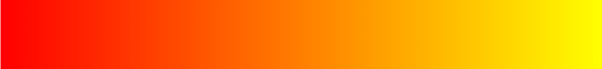
You can even specify direction in degrees e.g. 60deg instead of to right in the above example .
#7. Radial Gradients
Radial gradients are circular or elliptical gradients. Rather than proceeding along a straight axis, colors blend out from a starting point in all directions.
Syntax : background: radial-gradient(shape size at position, start-color, ..., last-color);e.g.     #grad {
  background: radial-gradient(red, yellow, green);
}//Default
         #grad {
  background: radial-gradient(circle, red, yellow, green);
}//Circle

#8.Multiple Background Images
In CSS3, there’s no need to include an element for every background image; it provides us with the ability to add more than one background image to any element, even to pseudo-elements.
background-image:
url(firstImage.jpg),
url(secondImage.gif),
url(thirdImage.png);
These are the implemented CSS3 features that are new, there are other unimplemented features too , we’ll discuss them once they’re implemented
Hope you liked the mini tutorial.

Happy Learning …!!